Attach Charms
As part of the progression overhaul for New World, I was asked to mock a new screen for attaching charms to items, which would then imbue them with different perks; enhancing the power of weapons and armor. Theo goal was to create something that felt like a premium experience, but worked within proprietary engine constraints.
I collaborated with the UX Designer, taking her wireframes into high-fidelity artmocks through Photoshop where we iterated from the initial design and I had opportunities to make changes that ensured visual consistency among other in-game screens and heightened the user's quality of experience. With After Effects, I created a couple of new VFX animations for the charm slots, while also re-mixing some existing effects from the game. This allowed us to cut down our production estimate and ensure the feature could meet the deadline.
Below is the motion mock video I created with After Effects and Adobe Premiere to communicate the design to our design technologists for implementation:
"Before" UX Wireframe by Aslanta Chen.
Side by side, noting the differences I implemented as we iterated from the original wireframe. To be clear, any changes I ever make to a UX Designer's initial wireframe, is communicated with them and approved. I don't make changes unilaterally. I request changes when I find through my own analysis there's something to improve for the user's benefit. The UX designer also gets a clearer picture once brought into this more visual phase of development and typically have their own tweaks to recommend. The artmock becomes a very productive iterative cycle for the final design.
Short highlight of changes I made:
- Centered "ATTACH CHARMS" header text for more prominence, providing better balance of the two stages of flow since they are a recursive Step A to B process when attaching multiple charms.
- Decreased the width of the Search bar to maintain visual consistency with other screens.
- Revised CTA to a short label and removed "SLOTS" to reduce text clutter
- Removed Reset Changes button so we could bind it to a hold action on the footer (not present in current example image but was implemented), following reset paradigms in other screens for behavioral consistency.
Reusable Scoreboard
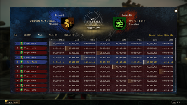
One of the game's pitfalls we had was that every game mode had it's own separate scoreboard logic, and so every time you intended to build a new mode, a new scoreboard screen would also need to be built. This would incur time for engineers and the UX team to facilitate. Our initiative was to create a reusable template, that game designers can take and run with for any future modes.
My part of the job was creating a motion mock and defining the final adjustments taken from the UX designer's wireframe. I needed to create a scoreboard layout that could stand up for different types of modes, and display various data depending on the mode itself.
It was an interesting challenge to divide game modes into different buckets, as you can see from the example mocks below:
Featured Game Mode
We were tasked with updating the Activity Finder screen to include more visibility on game modes as we planned to add more in the future. One of the adjacent goals of this change was to feature the brand new mode at the top of the list, with some added flair calling attention to it when you first come into the screen.
Collaborating with UX Designers, I iterated on the high fidelity mock through multiple loops through stakeholder feedback to define their ideal path forward.
Created Motion mock
Revised layout

I then worked with Design Technologists for implementation, providing callouts of ideal margins and potential overflow issues with localization, so we could ensure counter-measures to alleviate pain points.
War Declaration
This mock for New World provided me the opportunity to redesign the user flow for declaring war between two Companies for the claiming of a territory.
The original flow contained all of the necessary information but required five stages of screens to complete the process of declaration. My primary goal was to reduce the number of steps, while retaining all the important war information one would need, like the cost to declare and when/where the war would take place.
The original flow pertained as follows:
Declare War -> About War -> Siege Window -> Siege Tier -> Confirm Payment -> War Declared
After declaring, you'd then be exited from the flow and have to return to the map to reach the 'Manage Army' button where you would assign members to different groups for combat.


I folded the majority of information into one main screen. Having the ability to select what level of war camp you want to purchase and with which wallet now in one place, instead of two screens.
The "about war" screen was moved to a nested overlay that could be accessed by pressing the 'About' button. Experienced users are no longer burdened with information they already know, but can retrieve it if they need a refresher.
Even with all the screen reductions, I managed to include new information, adding details about the competing factions, providing more theatrics to what was at stake between players.
After declaring you're presented with a confirmation screen and the option to go straight to managing your army or to back out and return to game.
The new flow:
Declare War -> Confirm Details -> Manage Army


